Luminary
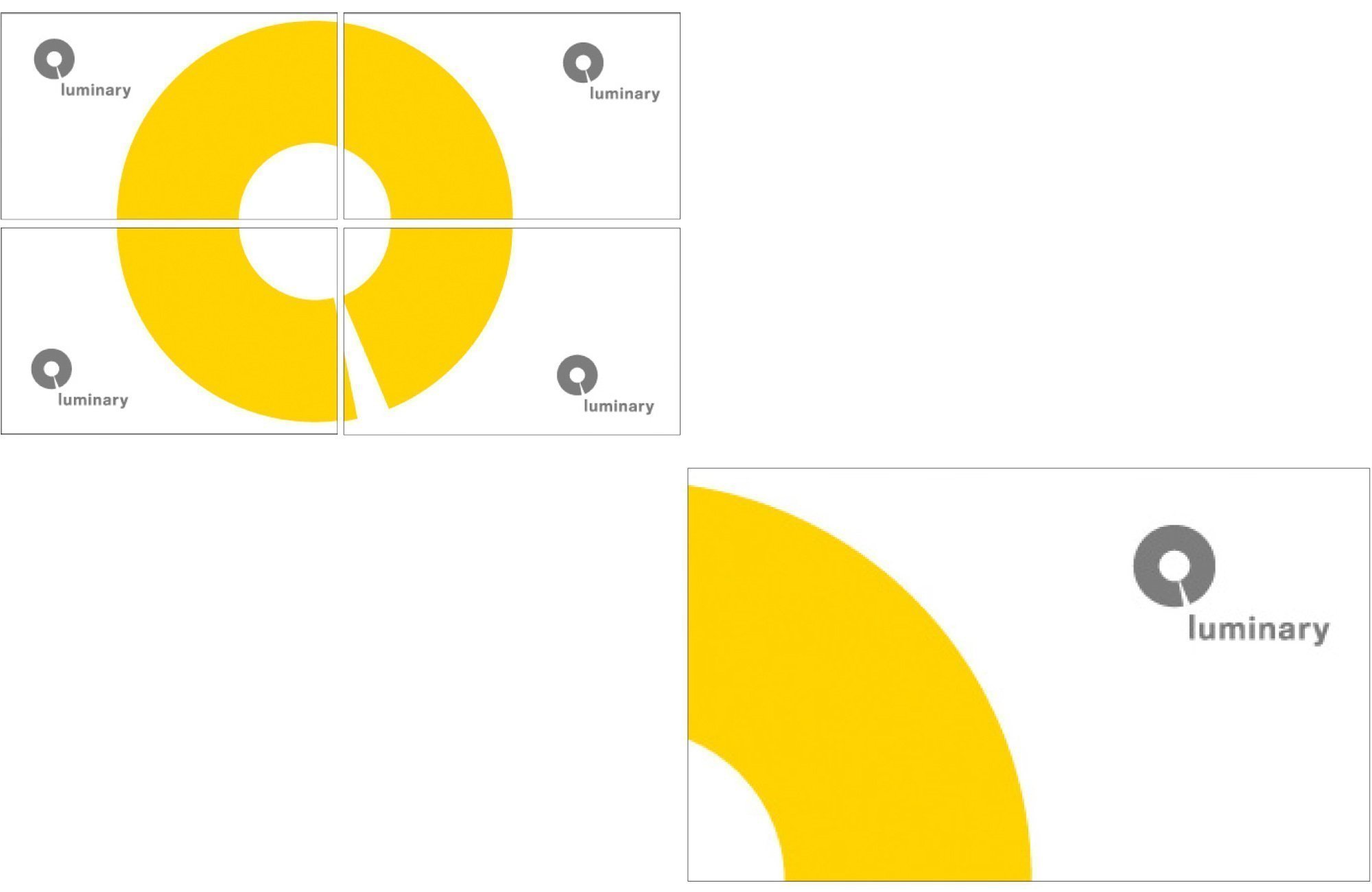
Logo and corporate identity material for a new lighting shop in Nicosia. The typeface for the logo is a variation of the Helvetica typeface. The circle blurs the boundaries between positive and negative space with references to the most symbolic of light sources, the sun, and to a spotlight which has its origin at the center of the circle and extending out to “form / illuminate” the word luminary.
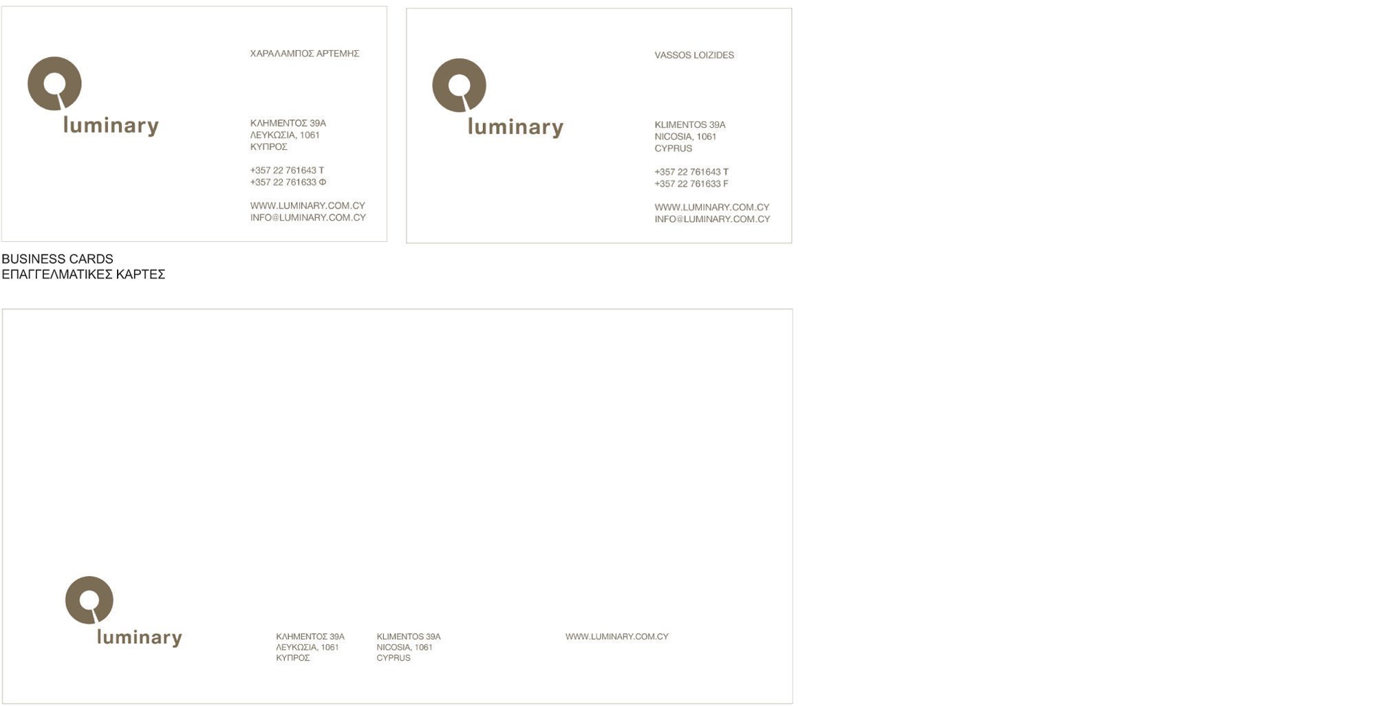
The application of the logo was done on the basic communication materials: envelopes, letterhead, folder, price tags, e.tc. A Pantone metallic ink was used throughout on a variety of paper types.

FINAL LOGO
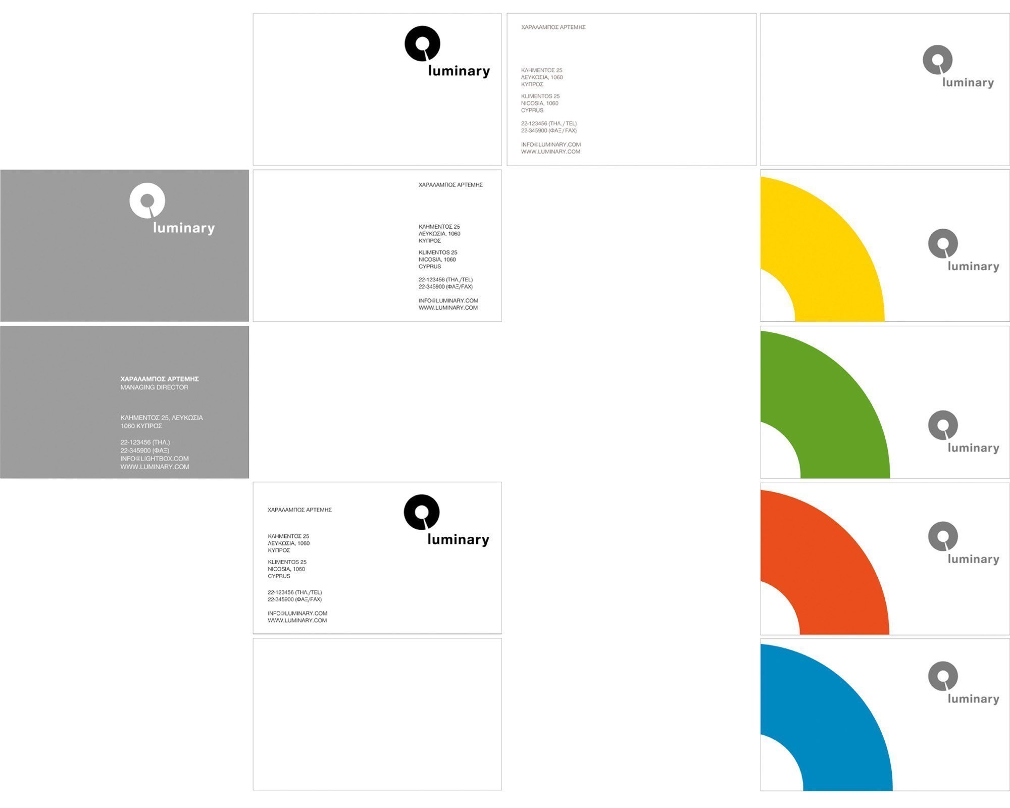
VARIATIONS ON THE BUSINESS CARDS
ENVELOPE
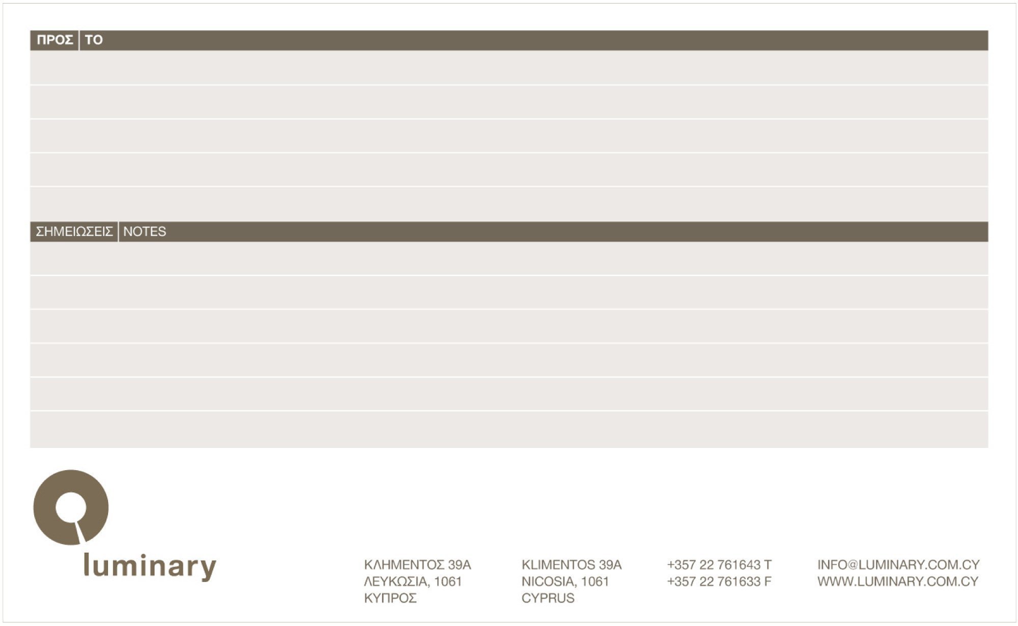
MAILING LABEL

DIAGRAM FOR THE DIE-CUT FOR THE FOLDER